UX Methodology
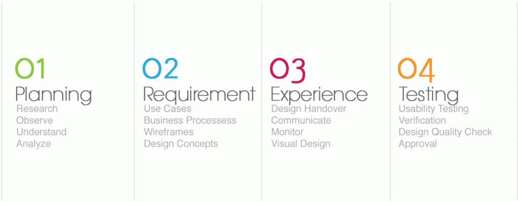
I am a huge advocate for User-Centered Design
I try to push this approach as I have found it to be the most time and cost effective. In a world where we all want instant results, inserting the users at the ‘front and center’ of what we do is the best approach, this ensures what we as UX practitioners are always focused on our end goal, and are always using research as the guiding light for our solutions. The key UX methodology I follow for my UX projects is the same; I ensure the involvement of the end users as often as possible. Of course, budgetary constraints can have an influence on how often we involve the user, but user involvement will not only improve the output of the project, but will also help to inform decision making which can often delay projects.Some of the methods I employ
-
Stakeholder Interviews
Conversations with the key contacts in the client organisation funding, selling, or driving the product.

-
User Interviews
User interviews are a key activity for understanding the tasks and motivations of the user group for whom you are designing. Interviews may be formally scheduled, or just informal chats (for instance, in a suitable location that your target demographic are present).

-
Competitor Analysis
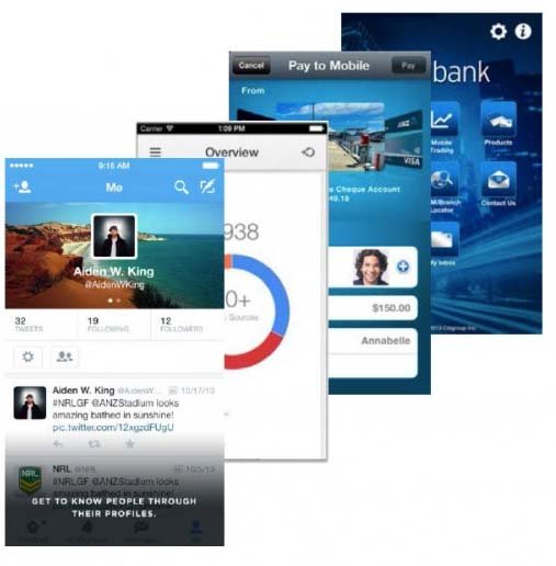
Performing an audit/review of competing websites and apps; conducting user testing of competing sites; writing a report that summarises the competitive landscape.
-
Analytics Review
Analysing web or mobile usage data, and making subsequent recommendations.

-
Storyboards
A storyboard is a tool inspired by the filmmaking industry, where a visual sequence of events is used to capture a user’s interactions with a product. Depending on the audience, it may be an extremely rough sketch, purely for crystallising your own ideas.
Sometimes it can be useful to create a slightly more polished version of this—a comic—to communicate this sequence of events to key stakeholders in order to achieve buy-in for a concept.

-
Personas
A persona is a fictitious identity that reflects one of the user groups for who you are designing.

-
Workflow Diagram
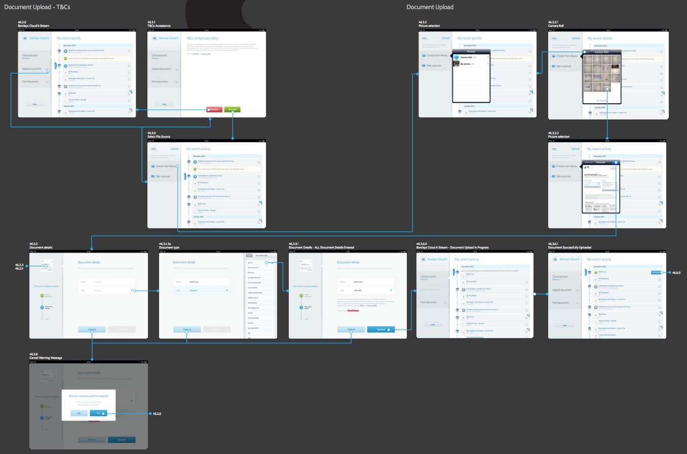
A workflow diagram (or activity diagram) is a graphical representation of activities and actions conducted by users of a system.
-
Card Sorting
Card sorting is a technique where users are asked to generate a folksonomy, or information hierarchy, which can then form the basis of an information architecture or website navigation menu.

-
Mood Board
A mood board is a collage, either physical or digital, which is intended to communicate the visual style a direction is heading (or should be heading). Stakeholders may use a mood board to provide a visual designer with the atmosphere they would like their site to convey and the colour palette to explore.

-
Wireframe
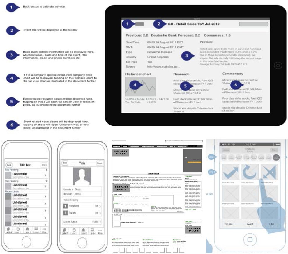
A wireframe is a rough guide for the layout of a website or app. A prototype is similar in that while far from being a polished product in terms of visuals or functionality, it gives an indication of the direction that the product is heading. “Mockups” is the term I use for wireframes that have been created in high fidelity, but for some people these three terms are interchangeable.
-
Prototypes
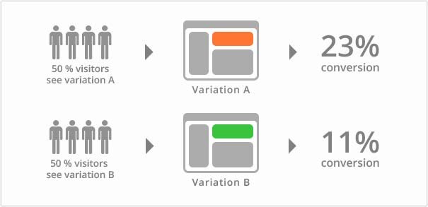
A Prototype is where an example of the website/application is created so that a user may click through it and navigate around the solution that is being proposed. The prototypes can be high fedility (using colour and actual content) or low fedility (placeholder text and grey boxes for media). This technique is great for A/B Testing as well as quantifying if the process and flows designed are having the desired effect.

-
A/B Testing
Good for testing new or experimental features before releasing them to all customers.
It has been stated by renown UX experts that project planning is a balancing act between getting the right amount of user input within the constraints of your project. I could not agree more with that statement.
First Phase: Project planning