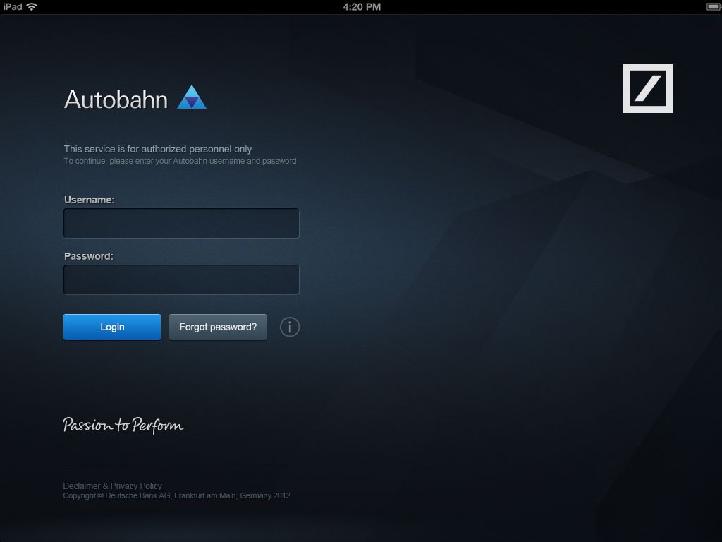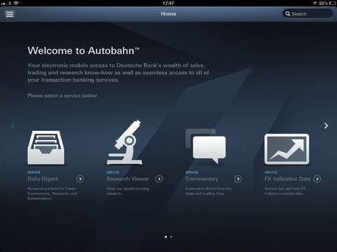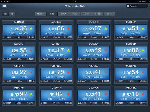
Autobahn
I was approached by Deutsche Bank to help create and enhance a mobile and create a tablet versions of their FX platform.
Project requirement
The idea was to change the lives of traders, make them use smart technology and make them more efficient.
The UX team were asked to be as innovative as possible, break new ground and help shape the future of FX trading.
Discovery phase
Stakeholder engagement
Due to the nature of the project, we scheduled a number of workshops with stakeholders as well as held interviews with them to ensure we had a good grasp of the requirements. The sessions were very open, where we discussed the lives of traders, how they currently get their information, how the bank wanted to solve the pain points as well as understanding the competitors in the market. We also reviewed the project breif as well as scheduling some time with the end uers via their respective managers.
We were able to ask them questions, such as:
- What they wanted the app to do
- How the app could help traders
- What were their objectives
- How they would deem success
User engagement
We were able to engage with a large variety of traders, some meetings were held at the traders location and some were held at our offices. We requested that the traders were able to give us 1 hour each, so that we can discuss with them:
- Their routines from the moment they woke up
- Their pains, what would they need to help them achieve their triggers
- What apps they used and when
- What type of websites they visited
- What information they need and when
All the information then was analysed and we were able to extract the info to ensure we had a thorough understanding of the business and users requirements.

Competitive analysis
The traders life is very busy and stressful, this means that there is not much time in the day that they can sit and read articles, to find items of note for them to research as well as discuss the market and its changes with their clients.
We looked into the various website services available to the trader, such as Bloomberg, Reuters, Forbes and FT.com. These were sites that they visited on a regular basis to get latest market information.
As part of our research, we reached out to some independent traders to see what tools and websites they used, so that we could go away and analyses those sites and apps.
We also conducted numerous user research interviews, to gather information on:
- A lack of an app that gives traders all the research material relating to their trades.
- They needed a dashboard that summerises what has occured around the globe as trading markets opened
- FX index data at any given moment in time
- Any new emails that have come in that they should read before any meetings
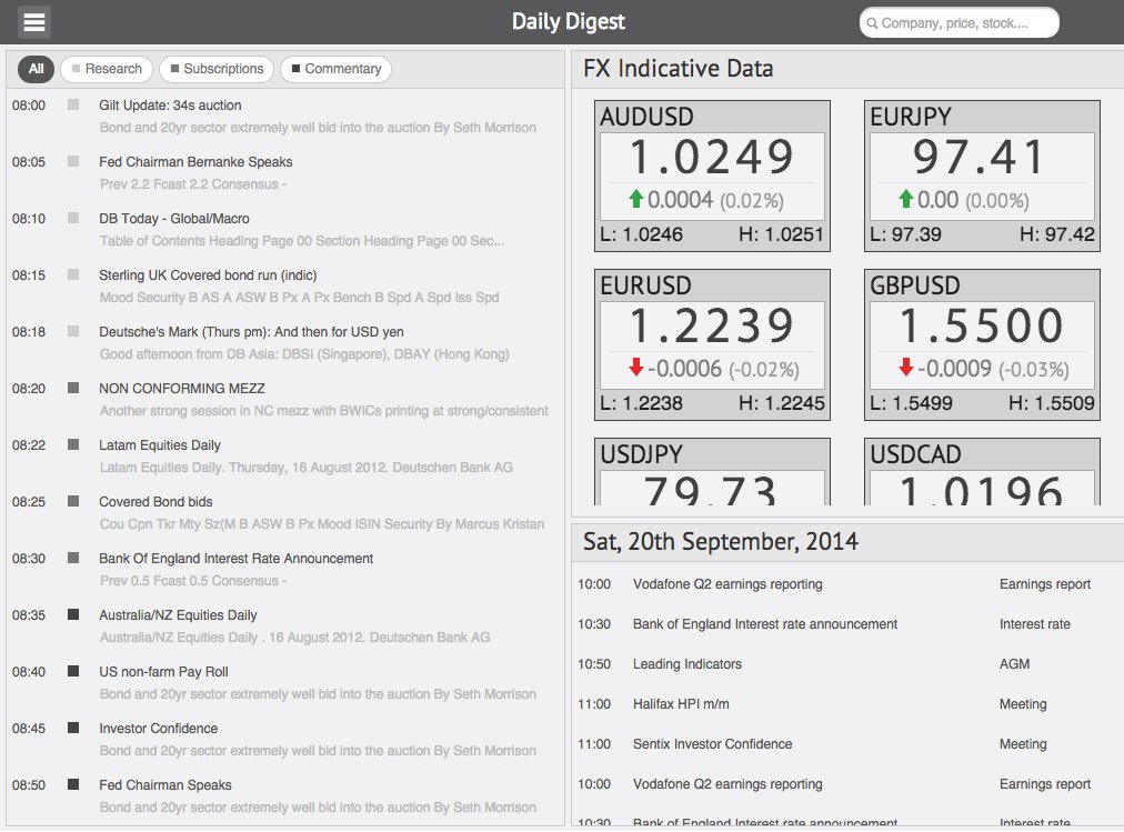
We decided that we could create a ‘Morning Digest’ which gave them a summary of all the above on their dashboard, which they could tap on to gain the full details of that article/story.
Conceptualization and sketching
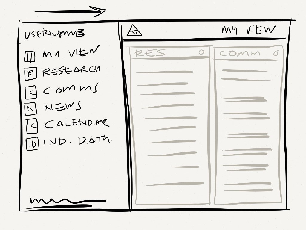
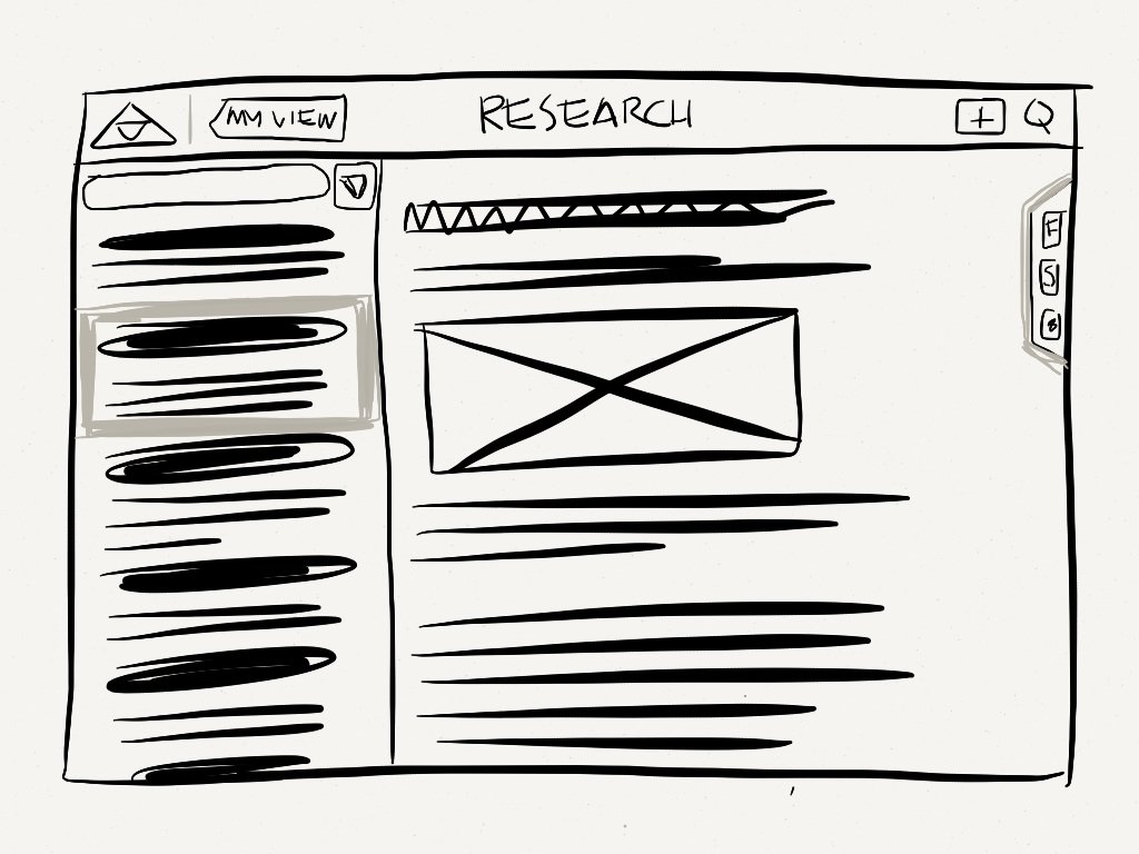
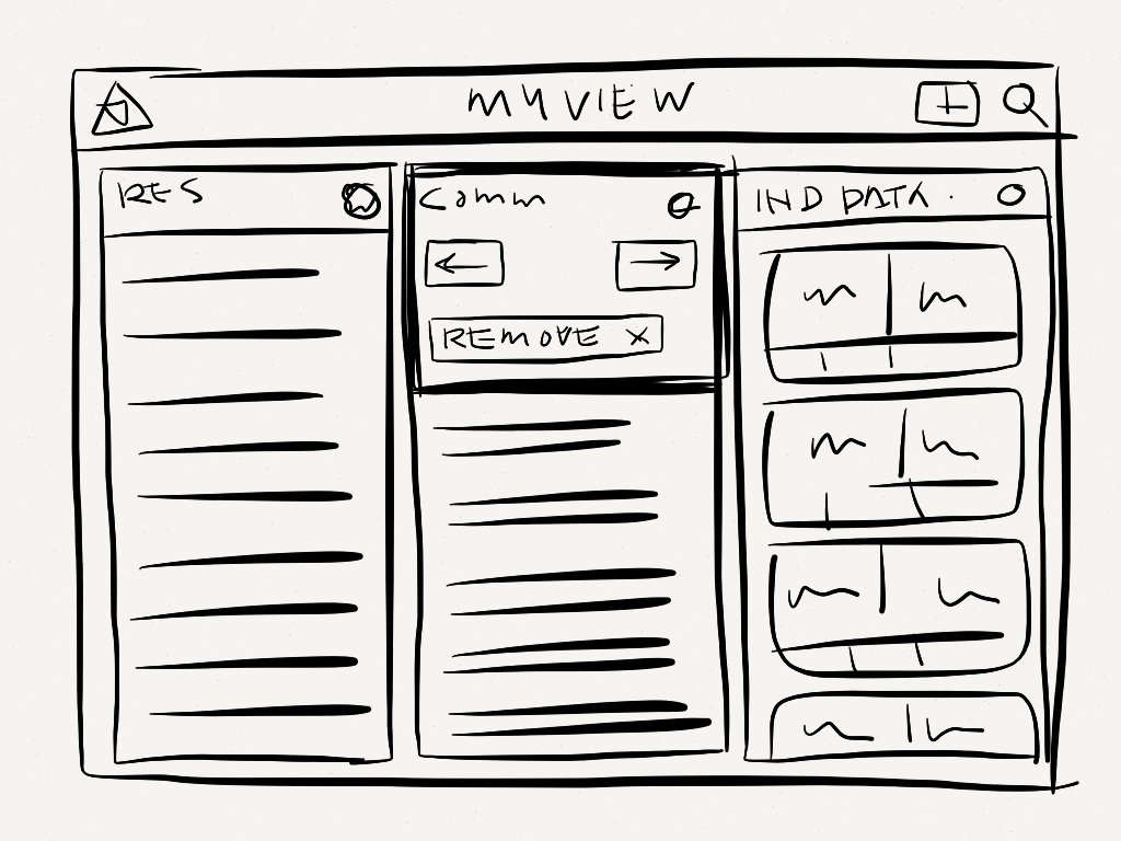
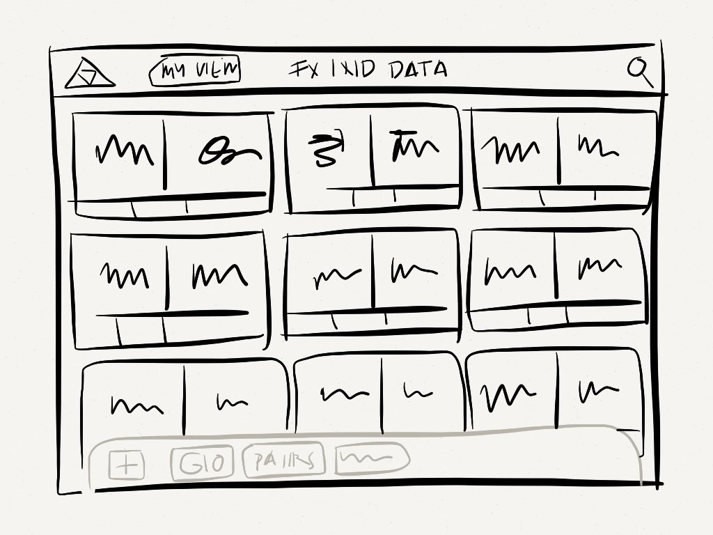
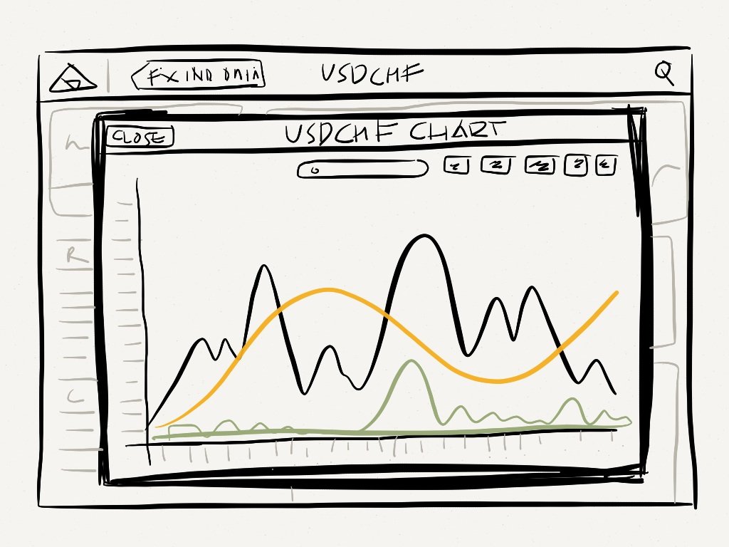
I created a number of sketches which I wanted to get tested asap, this was to ensure we were heading in the right direction, the testing we conducted was very rapid and enabled me to refine the UX and options we were going to pursue further.
Wireframing
We created quite a variable number of wireframe solutions to be tested, we wanted to ensure that traders were able to get the information they needed at the time they needed it.
User testing
We gained a huge amount of insight into the behavour of the traders, how they prefer information to be relayed to them and also the layout of their dashboards.
We recorded all the findings and analysed the feedback within the team, we were able to make sime significent changes to the UI & UX to ensure we were able to deliver a viable product that would have a positive impact on the traders and their lives.
Prototyping
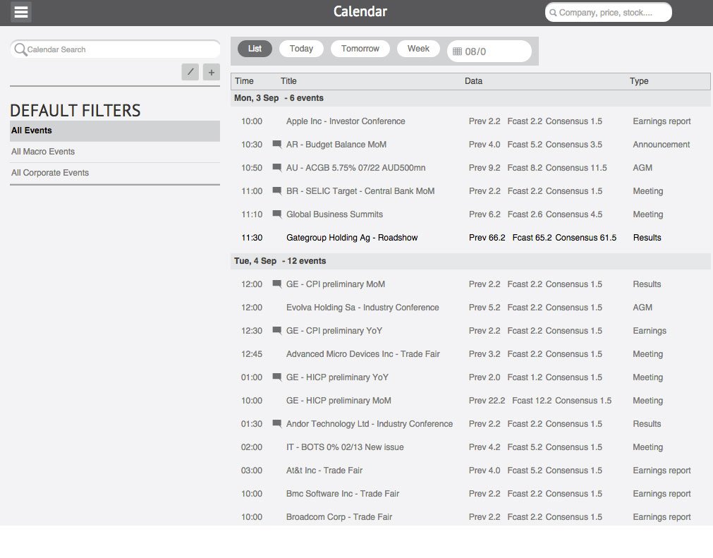
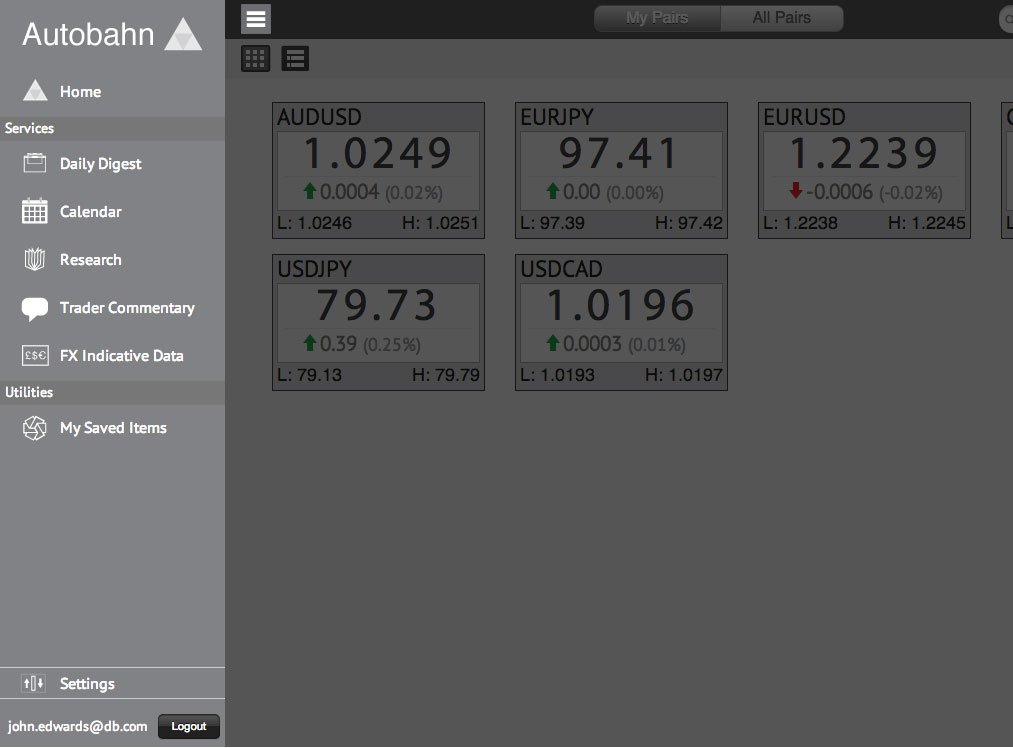
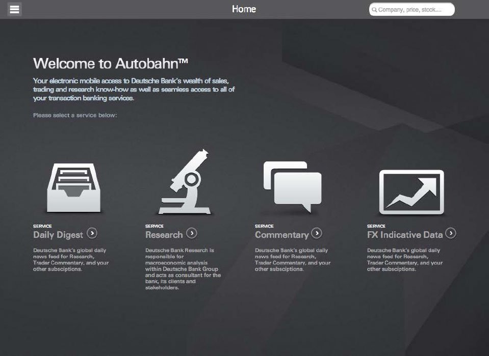
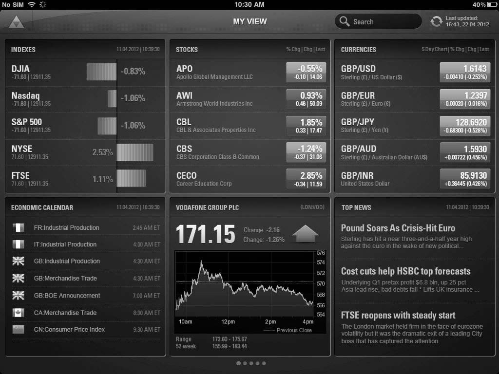
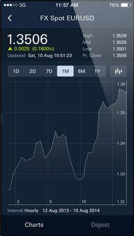
Once the wireframes had been signed off, we need to do some A to B testing on our concepts, to ensure that the best approach would be taken through to the design phase. I built the prototypes as hi-fidelity clickable prototypes, so we could use them in a lab environment and test the user flow, app layout and architecture as well as the interactions we had envisaged.The screen
shots presented here, are stills from the prototypes in action. We were able to utlise the findings from the testing phase to rework some of the app flows. The prototypes were then used by the dev team to build the app on iOS and Android.
Project outcome
The app was to put together research on movers of the day before a traders day begins, to provide research documents in relation to those trades as well as historical data.


