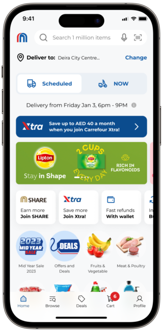
Carrefour

Achievement highlights (Post launch 2024)
152 ⇑ 46%
Average Order Value (AED)
2.7M ⇑ 80%
Gross Merchandise Value(AED)
40 ⇑ 81%
Net Promoter Score
(NPS)
3.8 ⇑ 73%
Customer Satisfaction Rate
10.9% ⇑ 474%
Conversion traffic to orders placed
5% ⇓ 1200%
Split order delivery at the same address.
98% ⇑ 18%
On time deliveries to destination
85% ⇑ 97.7%
Can track orders

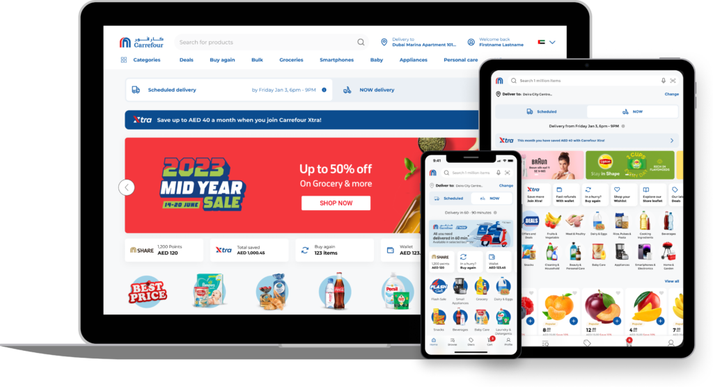
I had the privilege of leading and managing the UX design team with a focus on your website and apps as part of your transformative business project. Our goal was to elevate your online business, currently at 8% of the offline operations, by improving GMV, AOV, and NPS.
This user-centric approach aimed to make our digital platforms more intuitive, engaging, and aligned with the evolving needs of our customers. Additionally, we sought ways to enhance agility and speed up time-to-market for a seamless and customer-friendly experience.
My role
Manager UX Design and Strategy
Timeline
Oct 2021 – Jan 2024
Deadline
12 Months
UX team
- UX manager (Me)
- UX designers (7)
- User Research (4)
- Graphic design (4)
To identify and strategise solutions.
Co-creation team
- Chief digital officer
- Vice president of product
- Country managers
- Project managers
- Product owners
- Developers
For feedback and sign off
My deliverables
- Drive team OKRs for goal alignment and focus customer impact.
- Collaborate strategically with stakeholders to capture business needs.
- Formulate and execute a customer-centric UX strategy across MENA.
- Elevate user experiences and architect a comprehensive design system aligned with industry standards.
- Develop and document DesignOps processes for efficiency and innovation in customer-centric outcomes.
Background
I strategically chose the “Double Diamond” design process, enabling a structured and iterative approach to address uncertainties and achieve well-informed solutions. This enhances collaboration, ensuring clear navigation aligned with customer-centric and business objectives.

The Brief
Our digital experience lags behind our competitors in terms of usability, journey friction and quality of execution as validated by customer research and numerous independent UX audits. This places us in a position where customers perceive our experience negatively and do not perform as well as it could in terms of driving business impact.
By reducing the friction of key journeys and offering new key features – informed and validated by a best practice, data-driven, customer-centric approach – we can offer a competitive experience which increases business performance, is more efficient, flexible, agile and aligned with customer needs.
Some important facts from 2021-22 before project kickoff
105
Average Order Value (AED)
1.5M
Gross Merchandise Value(AED)
22
Net Promoter Score
(NPS)
2.2
Customer Satisfaction Rate
1.9%
Conversion traffic to orders placed
65%
Split order delivery at the same address.
83%
On time deliveries to destination
43%
Order tracking issues
Discovery phase
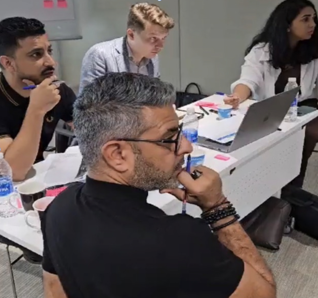
I refer to this stage as the “Diverge” phase, fostering engagement by encouraging team members to actively share their data and knowledge. During this phase, my primary focus is on comprehending and exploring the problem space as a team. Conducting research, observe, and gather information to uncover insights into the challenges and opportunities we are addressing.
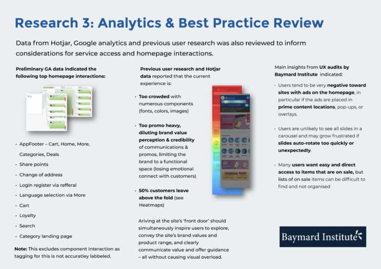
I spearheaded customer-centric workshops, collaborating with stakeholders to conduct a comprehensive analysis. Leveraging business insights, data analytics, customer feedback from app stores, NPS reports, and insights from call center interactions, numerous audit reports unveiled a significant gap in homepage engagement, where 95% of users predominantly relied on search.
This revelation spurred ongoing collaborative discussions to:
- Identify a crucial area for improvement, ensuring customer satisfaction.
- Emphasize the necessity for a holistic solution to capture vital data and user interactions accurately.
- Shift focus from hypotheses and assumptions to a more informed perspective.
The outcome is a strategic redirection towards an enhanced, customer-focused approach for a more satisfying user experience.
Persona empathy & journey map
The empathy map visually depicts customers’ thoughts, feelings, and behaviors throughout their grocery shopping journey. It forms the basis for a user-centric and empathetic grocery solution by addressing pain points, desires, and motivations. Additionally, the journey map provides a comprehensive overview of the entire customer experience, highlighting key touchpoints and interactions.
Data gathered
Audit findings
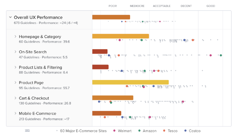
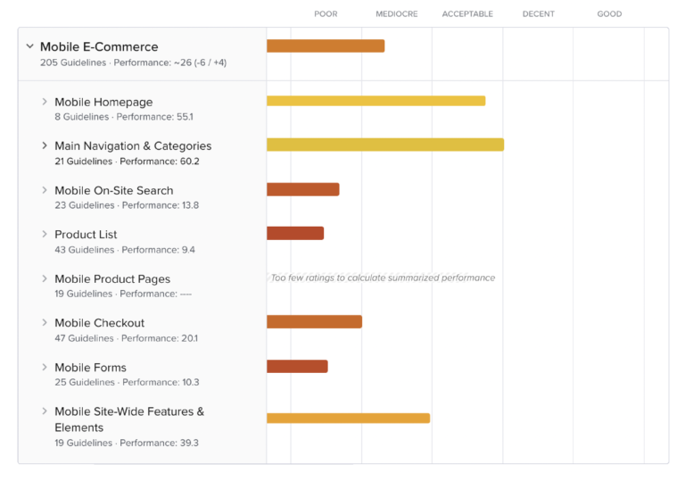
Conducting this audit involved a user-centric heuristic evaluation of Carrefour, drawing insights from an extensive 54,000+ hours of structured large-scale e-commerce usability testing and benchmarking. Utilizing indirect large-scale usability testing with over 1,200 user sessions, extensive eye-tracking studies, UX performance benchmarking, and quantitative analyses aimed to unveil overarching user behavior patterns in e-commerce. This approach, differing from traditional low-volume usability testing with 10-50 users, provided a holistic understanding of general user behaviors applicable to Carrefour.
The findings clearly indicate the imperative need for a comprehensive digital solution overhaul, aligning with user needs, to position Carrefour as a leader within the GCC.
Open points
We overspend on deliveries to the same location, how to reduce this?
- Can we rebuild the order tracking service?
Do we possess deatiled data on user preferences for purchases for predictive analysis?
Objectives
- Consider guest checkout journey to increase GMV
- Analyse cart to purchase abandonment
- Reduce the cost of delivery by not o,acting the business
- Drive insights related to personalisation.
Challenges
Identifying drop-off points may highlight friction or usability issues, impacting overall conversion rates
- Limited data may hinder accurate personalisation efforts, potentially leading to irrelevant user experiences.
My phase 1 scope
- Establish UX practice, DesignOps & Craft governance
Collaborate with analysts and back-office, I ensure accurate digital solution data and seamless funnel data capture
Craft a unified design system for consistency & best practice.
Competitive Analysis
Competitor analysis informs our strategy, providing insights into market trends and areas for differentiation. Understanding strengths and weaknesses allows us to position ourselves strategically, fostering continual improvement.
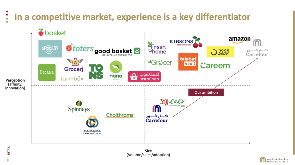

To elevate user experience, engagement, and competitiveness for “Carrefour” against rivals like “Walmart”, “Tesco”, “Noon” and “LuLu” strategic enhancements and innovative features need be deployed. The table above illustrates the benchmark for required features and enhancements to align with management goals and outperform competitors.
Define phase
In this phase, we converge all the data gathered to distill information, aligning perspectives, and defining clear design goals and user needs. My goal is to frame problem statements and outline some user stories guiding the design process.
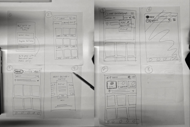
Entering the ideation phase, I initiated exercises to ignite creativity. I engaged in a round of crazy 8’s, generating 8 ideas in 8 minutes. Following that, I conducted a ‘bad idea/good idea’ exercise, transforming 5 initial bad ideas into positive concepts.

Problem statement
In the current grocery shopping landscape, customers face challenges in navigating various platforms and sources for their needs, leading to a fragmented and time-consuming experience. The potential solution involves creating a grocery app that streamlines product discovery, simplifies navigation, and boosts user engagement. The goal is to offer a more connivance, efficient and satisfying shopping experience.
Leveraging the gathered data, we formulated the following "How might we" statements to aid both design and development teams.

- "How might we design a grocery solution that builds user confidence in staying well-supplied, ensuring a seamless, consistent, and frictionless omnichannel shopping experience, anchored by a unified design system for enhanced customer satisfaction?"
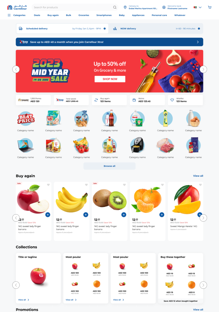
- Enhance the effectiveness of the homepage for both business and customers?
- design a mixed shipments solution that fosters user confidence in a streamlined and well-informed shipping experience?
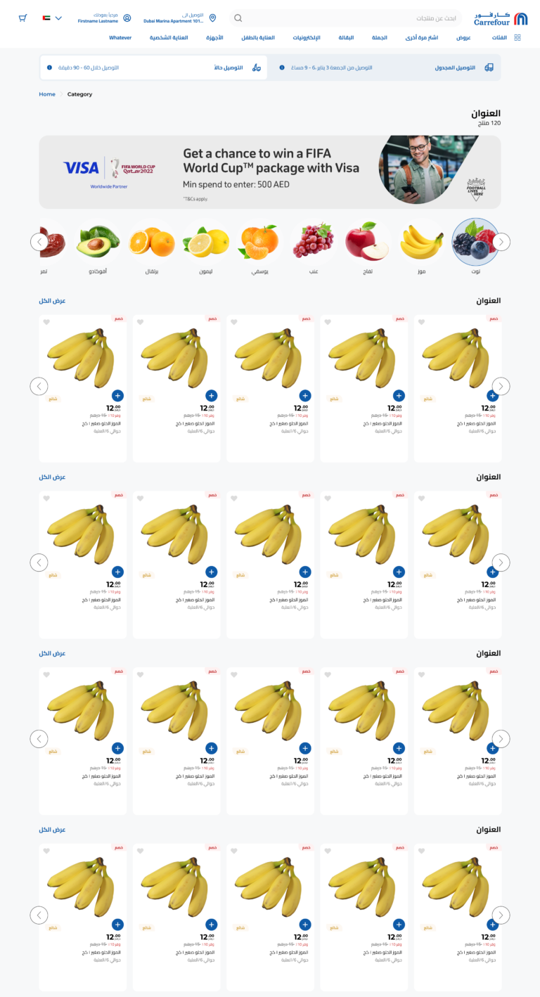
- Revise and organise shopping categories to ensure optimal efficiency and accessibility, creating a seamless experience for all users
- Design an order delivery solution that fosters user confidence in receiving timely and accurate deliveries, ensuring a seamless and satisfying shopping experience?
Hypothesis
- Offering different journeys between delivery types will decrease delivery cost for per order whereby increase profits
- Streamlining the ordering process will reduce instances of split orders for enhanced efficiency.
- Incorporating personalised homepage and streamlined checkout processes, will contribute to a significant increase in GMV
- A design system may reduce design and development efforts, leading to a decrease in time to market (TTM)

MoSCoW Method
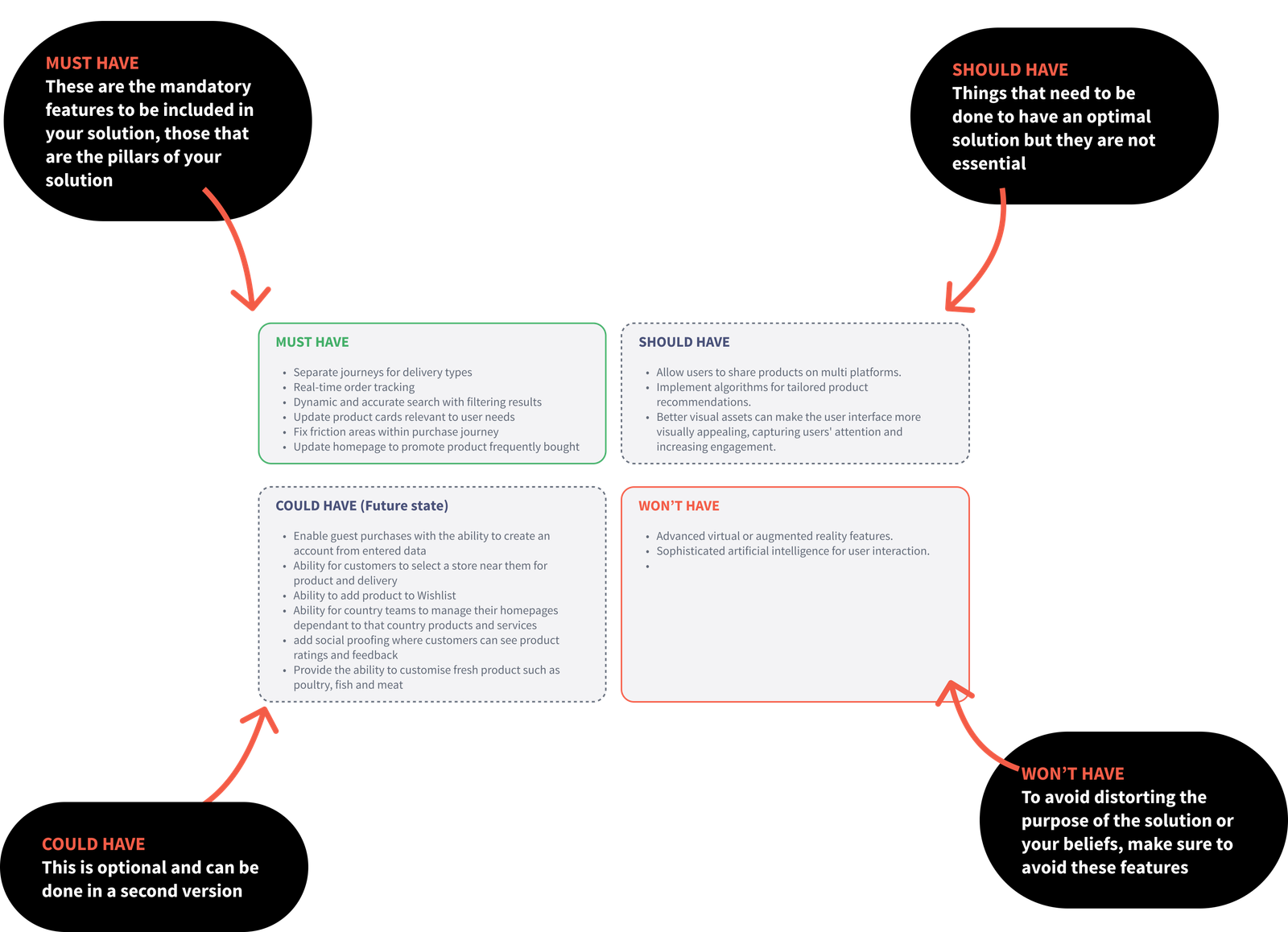
We implementing the MoSCoW method for our news digital solution streamlined prioritisation, ensuring we focused on must-have features, delivering an impactful and user-centered product within set timelines.
Develop phase
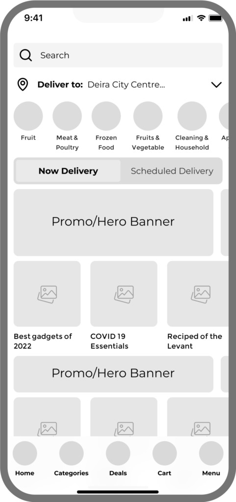
Transitioning to the ideation phase, I transform specified concepts into user-friendly solutions aligned with personas from research. Collaborating with the dev team to ensure feasibility, I engage in ideation, prototyping, and iterative refinement of designs. Rigorous testing of wireframes is conducted to ensure alignment with research insights and adherence to user-centric criteria.
- Generate ideas using the Crazy 8 method
- Outlined potential user journeys to discover touchpoints across omnichannel
- Established the information architecture for news consumption.
- Compiled a list of potential features for the product
- Iteratively refining & adjust designs based on ongoing usability results
- Recognized possible challenges and risks linked to the proposed ideas

My goal was to empower Carrefour businesses by offering the data, knowledge, support, and standards required to create intelligent products and services that provide enhanced value to our customers.
The transformative journey should positively impact the entire business, influencing not only user perception but also operational excellence across diverse regions.
Conducting numerous design iterations guided by research findings and consept, usability tests, we methodically addressed feedback, refined functionalities, and optimised the overall design.
My objective was not merely to meet but to surpass user expectations with the final solution, incorporating insights from each iteration to deliver an exceptional customer experience.
Hypothetical information architecture
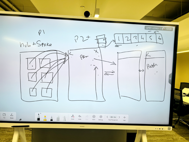
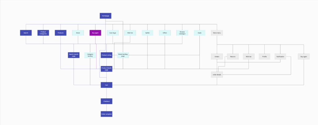
In crafting the information architecture for an app like Carrefour, meticulous planning ensures seamless navigation and intuitive organisation of content. Streamlined categories, clear labels, and efficient pathways enhance user experience and facilitate effortless exploration.
Crazy 8's ideation, explorative interviews, concept testing & usability testing
Deliver phase
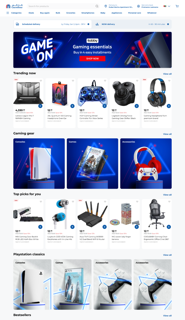
In the delivery phase, I created & employed the Elementary design system to create polished onmichannel designs, incorporating best practices and insights validated by customers. These designs undergo thorough usability testing with our in-house research team to ensure seamless alignment with user expectations.
In close collaboration with UX, development & QA teams, I provide comprehensive guidance on implementing modular components, defining user interactions, and optimising motion. By streamlining asset gathering and adhering to the established design system, we not only enhance speed and sustainability in development but also significantly reduce time to market.
The newly formed components are then transported into code and using the same fundamental elements. This approach not only ensures a user-centric product but also brings tangible business value through efficient and timely delivery.
Design system artifacts
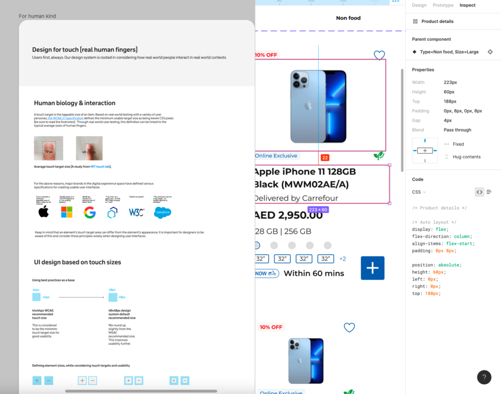
Introducing “Elementary“, our user-centric design system crafted with atomic design principles. From style guides to UI patterns, it unifies our visual language, guaranteeing efficiency and consistency in every product development stride.

Explore the meticulously designed components of our Elementrty design system, incorporating industry best practices and validated by customer feedback.
Usability & hypotheses observations
- Offering different journeys between delivery types did decrease delivery cost for per order & increased profits
- The implementation of the new design system has reduced Time to Market (TTM), resulting in saveddesign & development time and team efforts.
- 92% of participants, understood the homepage utility relating to delivery types, services and features
- 89% of participants perceived the new UX to be intuitive and user-friendly gestures adding items to cart an element of fun.
- 90% of participants had a positive perception of the visual design of Carrefour's new digital solution
- 83% of participants loved the new personalised homepage especially their frequently bought products & wishlist items
- 85% of participants felt they should not pay for deliveries if their cart value is higher than AED50
- 34% of participants felt all products should be able to be delivered at the same time, which does have an impact to the business

What I learned
Recognising the potency of having in-house research, design, and development teams dedicated to crafting a design system focused on user engagements and interactions.
The synergy created by these integrated teams allowed for a seamless and collaborative approach, ensuring that user needs were not only understood but also effectively translated into a cohesive and user-friendly design system.
The importance of collaborating with diverse stakeholders, both locally and internationally. Engaging with onshore and offshore teams enriched the project with valuable insights, emphasizing the significance of clear communication and cultural sensitivity.
This experience has shaped my project management approach, highlighting the crucial role of considering the solution from all persona perspective in every collaborative effort.
Post launch data 2024
152
Average Order Value (AED)
2.7M
Gross Merchandise Value(AED)
40
Net Promoter Score
(NPS)
3.8
Customer Satisfaction Rate
10.9%
Conversion trafic to orders placed
5%
Split order delivery at the same address.
98%
On time deliveries to distination
85%
Order tracking issues
Future state for Carrefour
As I concluded my time at Carrefour, I was pleased to have contributed to the organisation’s future success by leaving a comprehensive plan for ongoing enhancements. This roadmap, carefully crafted and extending over a period of six months, outlines a strategic vision for refining and advancing various aspects of the company’s operations, ensuring a trajectory of continuous improvement and innovation beyond my tenure.
“
Rahim is a standout force, bringing vast design, product, and business experience to our team. His unique ability to keep everyone focused, coupled with self-belief and empowerment, sets a tone crucial for today’s design delivery teams.
Integral to our highest-profile projects, Rahim’s behind-the-scenes support, innovative problem-solving, and compelling storytelling make him an invaluable all-rounder. Whether delving into intricate user challenges or assisting UI designers, Rahim’s contributions consistently add exceptional value.
His contribution to turn around the App user experience from average to very good was truly remarkable, and reflected on customers’ KPIs.

Jamal Chaabate
Vice President Of Product Management @ Majid Al Futtaim
