Construct the Experience

Creating User Stories & Persona’s
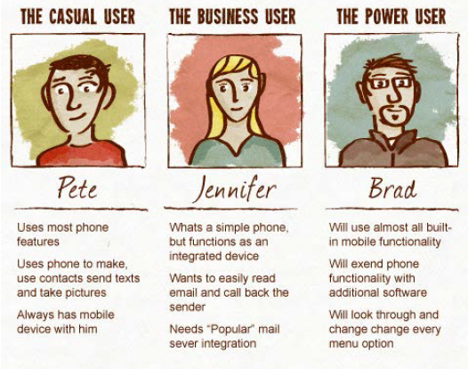
I create the user stories from the user feedback we have received. As well as main features the system should perform.
I beleive that the user stories are one of the most important facet of a UXer. As it shifts the focus for the new/revamped system from the business to the end user.
I try to put myself into the shoes of a user, I ask myself the same questions I ask durning the research phase;
- What am I doing/trying to do
- How can I do this better/faster
- Is there anything slowing me down
- Am I able to do fulfil my task
- What improvements can I make to the system
At its basic level, a user story should contain 3 parts, or the 3 W’s, these are;
- As a [WHO]
- I want [WHAT]
- Because [WHY]
Here is an example of a user story
As a POWER USER, I WANT to be able to login to my account and PERSONALISE the DASHBOARD, by adding/removing items and making the dashboard more relevant to me.
This will make it easier for me, as I can see and action items from the dashboard that are important to me.
Build User journies/story boards/flows/maps
I try to use all my use cases and fit them into the user flows, to ensure that all situations have been addressed. Furthermore, this process also allows me to fine-tune the UX, if there are any issues/pain points/pitfalls in the processes, which I have proposed.
When working in a larger UX team, I have found in the past, that the user flows, allow all team members to focus and, ensure that we are all solving issues in a consistant manner.
Mind/Functionaly Map
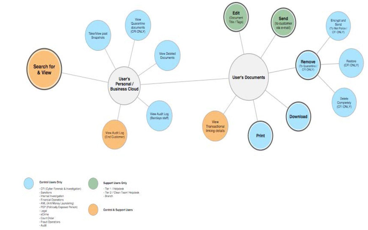
Below is a mind map of the activity/functions a user may undertake.
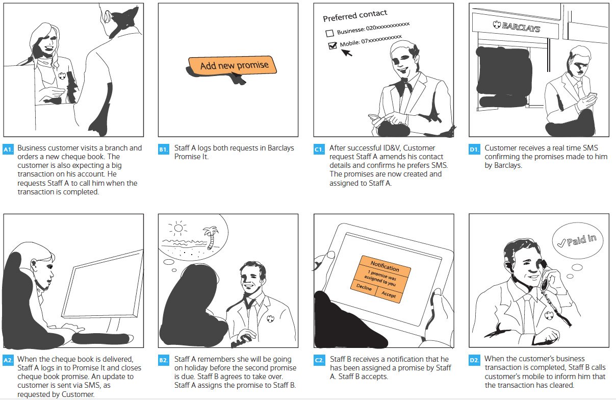
Story Board
Below you shall find a story board, of a typical scenario I had considered for a previous project.
User Journey
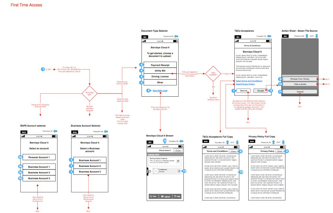
Below, you shall see a typical user journey diagram, where a user has to accept the system’s Terms & Conditions prior to using the system.
User Flow
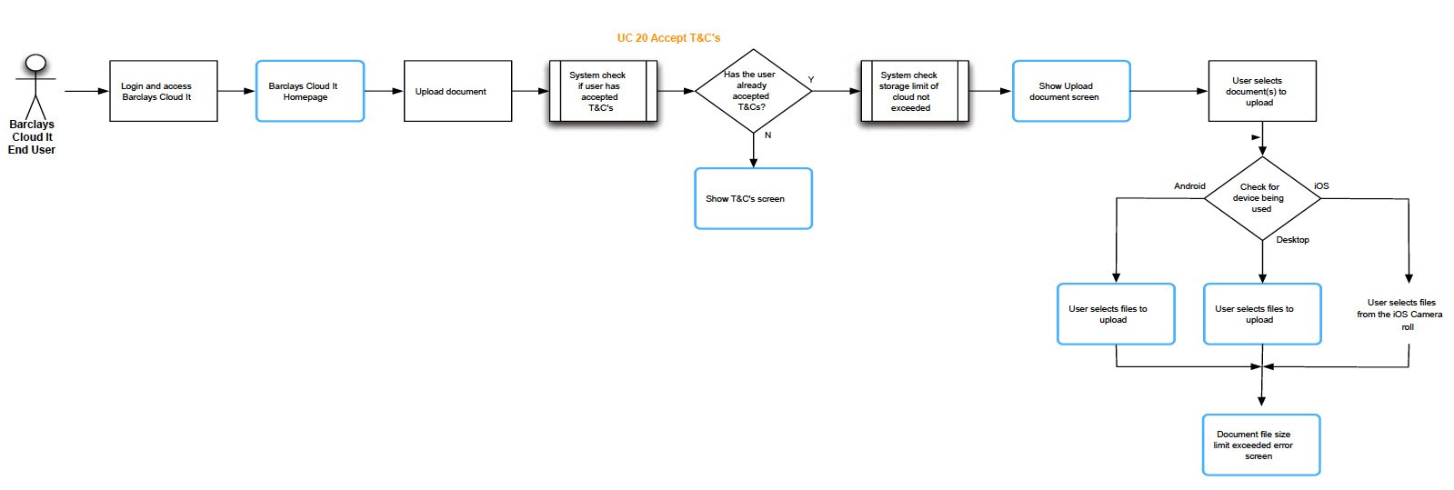
Below is an example of a user flow within an app, showing the interaction and screen transitions.
Site Map
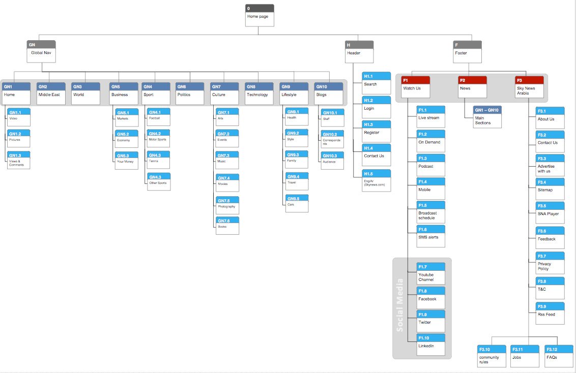
Below is an example of a site map, for a website, howing the information flow and document hierarchy.
I prefer to share the journies flows, maps and other final documents with the stakeholders at an early stage, once we have tested our solution with users and have had a chance to digest and incorporate the feedback. The stakeholder meetings are then held facilitates dialogue where I try to discuss;
- what the issues were from a users perspective
- how we aim to solve them
- how a user would undertake a given task
- what system changes may need to be made to acheive the solution.
- what we believe to be the issues addressed and improvements made
Once the discussions have been help, and the feedback analysed, I get to work on the updates and again get validation from the users on any changes, by testing the scenario’s out. The final documents are then sent to the stakeholders for final evaluation and a meeting is held to get sign-off.
Conceptualising
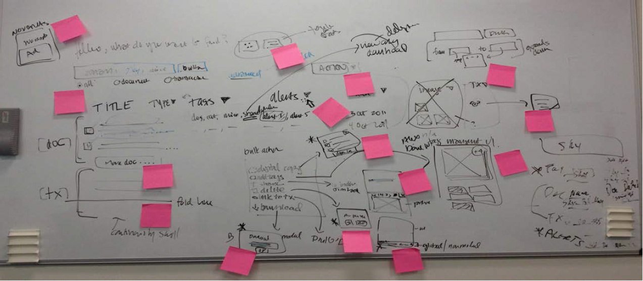
I prefer to begin the conceptual phase, by sketching low-level concepts on a whiteboard if possible. I do this for a number of reasons, mainly as it allows the rest of the team to join in and provide swift feedback as I continue the sketching and planning the flows out.
I like the team to pick up markers and join in, make alterations, edits and improvements.
The exercise allows me more flexibility to ‘rub’ out concepts and add new ones, as more feedback and interaction takes place between the UXers, designers and developers. Sometimes, this excersise can get a little hectic, but it helps the team focus/engage and voice their thoughts and concerns.
Sketching
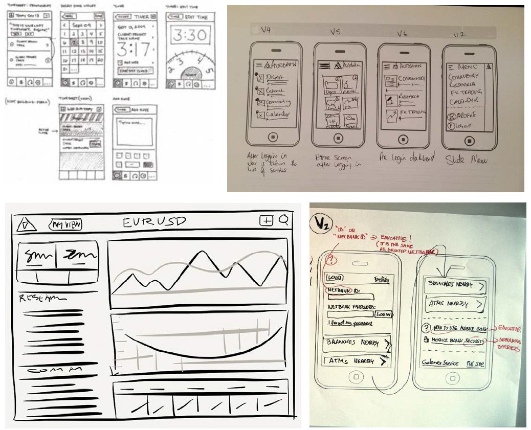
I begin by sketching mid-level concepts on paper. I have found this, to be the best way to generate many ideas as possible and with the least amount of time.
I often convert my best ideas onto an iPad, this makes it easier for me to focus on iPad designs and wireframes. I use a sketching app on the iPad to acheive the wireframes. I number my ideas, and share and discuss these with the UX and creative team members.
Once we have trimmed down the concepts to a few that we have strong feelings for, I then jump onto a wireframing tool such as Axure, Balsamiq or Omnigraffle.
Wireframing
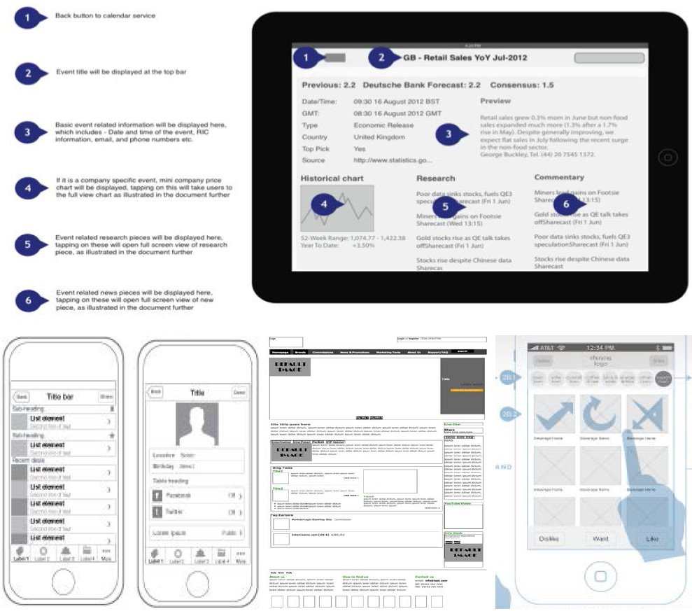
I ennoy wireframing as I finally get on a mac and begin putting all the best sketching ideas onto digital format. This allows my ideas to be shared with other UXers on the project, for them to view my ideas and provide further feedback and updates.
As a team, we then put together all our various wireframes together, thereby providing a holistic view of the proposal.
I am able to share these with the stakeholders, have face to face conversations and workshops to explain the ideas, thoughts and decisions, as to how and why we have made the choices and flows.
Prototypes / Clickable wireframes
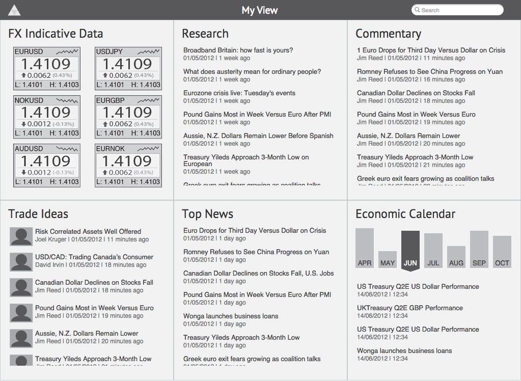
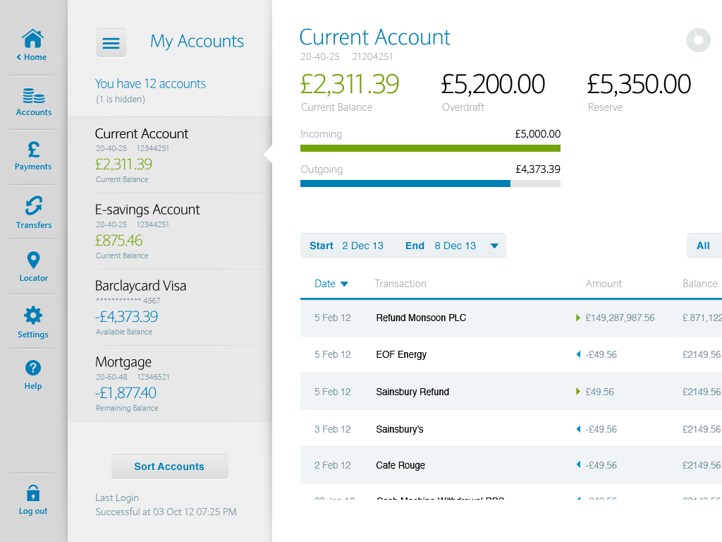
Low fidelity Axure prototype
Having been a front-end developer, I am able to convert my wireframes into clickable prototypes. I can create clickable wireframes using Axure, which has most of the functionality needed. Sometimes, I prefer to create HTML prototypes, as they might be better suited to bring my ideas to life, as I can add transitions, flows and data to showcase the UX. Furthermore, I can mimic an iPad app much more with HTML than using Axure, as the HTML will flow and can be saved as if an app on the homescreen, where it can be launched from without navigational buttons and other assets.
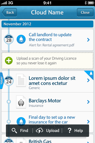
High fidelity HTML prototype
The prototype below was done using HTML/CSS/jQuery, this was used for our final iteration of the iPad app. We used this as a usability testing tool, with our end users as well as with stakeholders.
It allowed us to test out various transitions and colour skins to decide not only the layout and how usable it was for the users, but also to allow us to showcase the concept of personalisation, how a user could interact with it as well as how simple our concepts were for user to follow.
We did the same for the iPhone app, for the same reasons as above, but also to ensure branding, typography, and tone of the language was applied correctly.
Once we had the feedback from our testing, we were able to make changes to the protoypes very quickly, and then retest the updates. Depending on the outcome, we would then retrospectically update the wireframes to match the new decisions. Doing this allowed us to be lean and agile in our workflow.
[vc_row][vc_column width=”1/1″] [vc_title title=”Fourth Phase ” title_align=”text-left” title_tag=”big_head”] [vc_message color=”alert-info” style=”square” el_class=”nextBox”]